Lowell Observatory's Astronomy Interactives
Three touch- and sensor-driven interactives that turn invisible light, the math behind alien life, and a message to the cosmos into things visitors can drag, turn, record and send.Made for Lowell Observatory's Astronomy Discovery Center and its 100,000+ visitors a year.
Product Design • Interaction Design

Project Overview
Client: Lowell Observatory
Team: Trivium Interactive
Timeline: 2021 - 2024
My Role: Product Designer
Lowell Observatory is a research and public observatory in Flagstaff, Arizona. For its new Astronomy Discovery Center, Trivium built a suite of interactive exhibits that turn things you'd normally read about, like invisible light or alien life, into something you can actually touch, hear, and play with.
I designed eight of the Discovery Center's interactives, part of a larger set built by several designers on the team. Three of them show the range best: Send Your Message, Decoding the Drake Equation and Mixing Wavelengths.
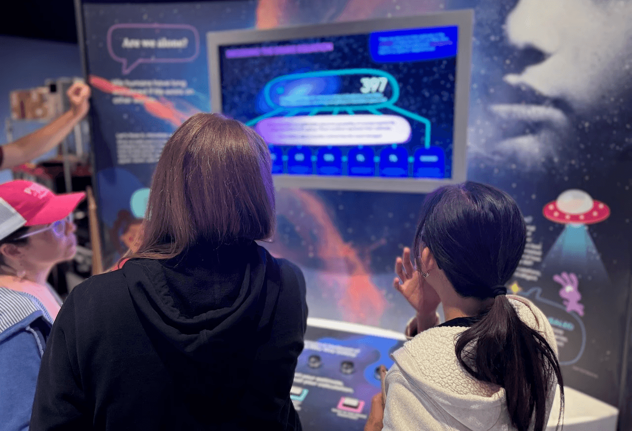
My Role
Designed eight interactives end to end, from user flows and prototypes to wireframes and high-fidelity UI.
Kept the visual language consistent across a multi-designer team, so interactives by different designers still read as one exhibit.
Ran developer handoffs and user testing, working with PMs, creative directors, fabricators and content teams.
Presented design work to stakeholders for feedback and iteration.
Joined client-attended alpha and beta reviews, walking through the interactives to refine the final experiences.
Challenges
Each interactive had to be playful yet informative, and work for kids and adults alike.
Abstract, invisible ideas like unseeable wavelengths and the odds of alien life had to feel tangible while staying accurate.
Everything met WCAG, and consent had to live inside Send Your Message since messages go public.
Several designers built the full set, so type, color, and behavior had to stay consistent across all of it.
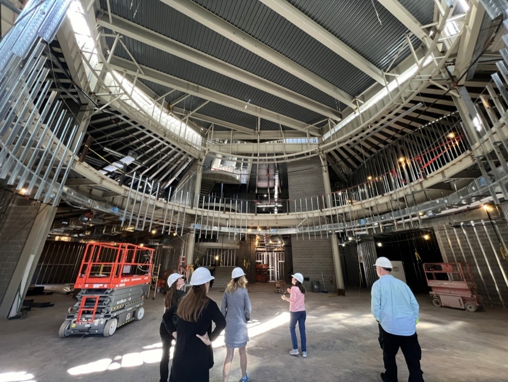
With real exhibit being built at Lowell, we tested the interactives remotely before install.
The Solution
Turned dense science into interactive learning so a broad audience could grasp complex ideas by doing, not reading.
Layered content so one screen serves younger visitors and experts alike, with deeper explanations a tap away.
Worked with Lowell's scientists and educators to keep it playful and accurate.
The monitors were mounted for ADA reach, so I put the interactive elements where kids and wheelchair users could reach them.
Built explicit opt-in into the flow so user-generated content publishes only on a deliberate confirm.
Research Process
Findings & Insights
1. Goals and constraints
We kicked off with Lowell and our design partner Kei Space to align on target visitors, the learning goals for each interactive, and the gallery layout. I worked to understand what each experience needed to do, both educationally and experientially.
A key early insight was the physical setup itself. The monitors were mounted for ADA reach, which shaped where interactive elements could go so the physical controls were part of the experience, not add-ons.
Lowell's astronomers and educators fed content to our content team for accuracy, which helped me understand the scope and depth of each interactive. The content was dense and technical, so I planned for layered, minimal copy from the start.


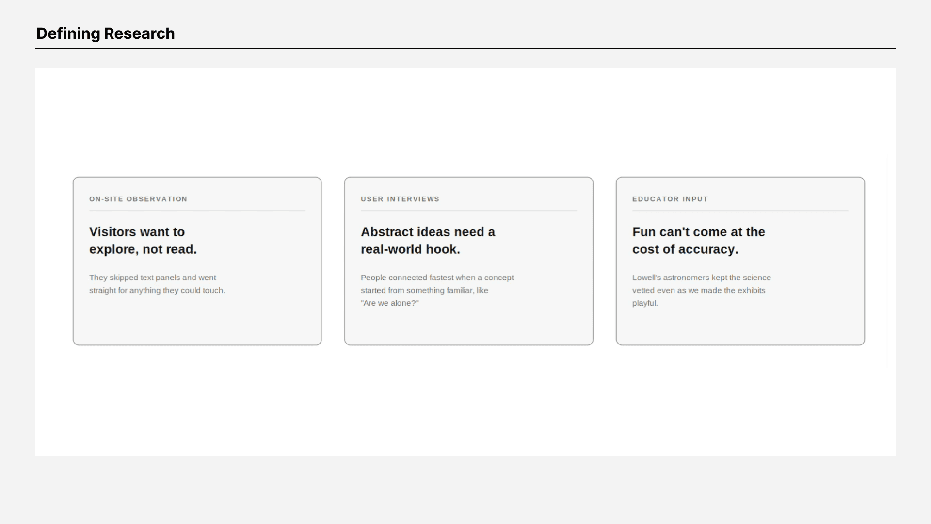
2. Defining Research
We worked from Lowell's understanding of its audience and informal interviews with families, students and docents to build rough profiles/user personas.
We benchmarked similar science and museum interactives, drawing on patterns around touch surfaces, layered content and pairing physical controls with on-screen response.
We reviewed design packages with Lowell and Kei Space. Their astronomers and educators guided the content, while our team translated it into concepts, wireframes and prototypes.
What those methods surfaced:
3. Discovery & Exploration
Early observation and the concept phase pointed to a clear direction: don't make visitors read about astronomy, let them do it. Each interactive turns one abstract idea, invisible light, the odds of alien life, a message to space, into a physical action with an immediate response.
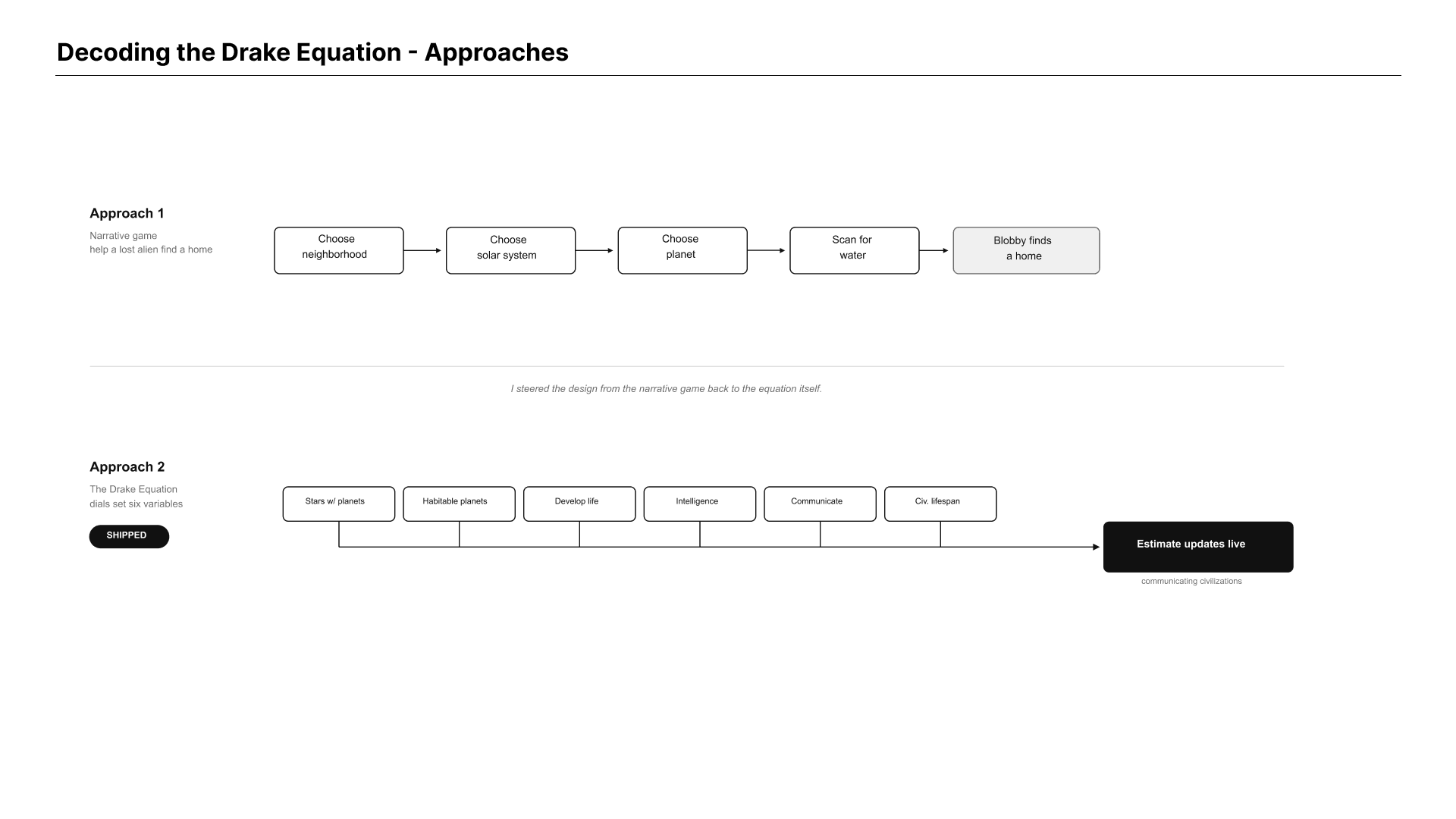
One interactive took two very different directions before it shipped. For Decoding the Drake Equation, I explored a narrative game where a visitor helps a lost alien find a home, then steered the design back to the equation itself.
4. User flows
Each interactive got its own flow, mapped before the UI, to define how a visitor moves from the attract screen to the payoff. Each flow also carries the visitor it was built for.
The Send Your Message flow guides a visitor through recording, adding a photo, and reviewing before a deliberate send, with consent built into that final action so nothing reaches the public wall until the visitor chooses.
The Decoding the Drake Equation flow. Visitors turn dials to set six variables and watch the estimate recompute live, looping back to adjust, with optional pro-tips for anyone who wants deeper context.
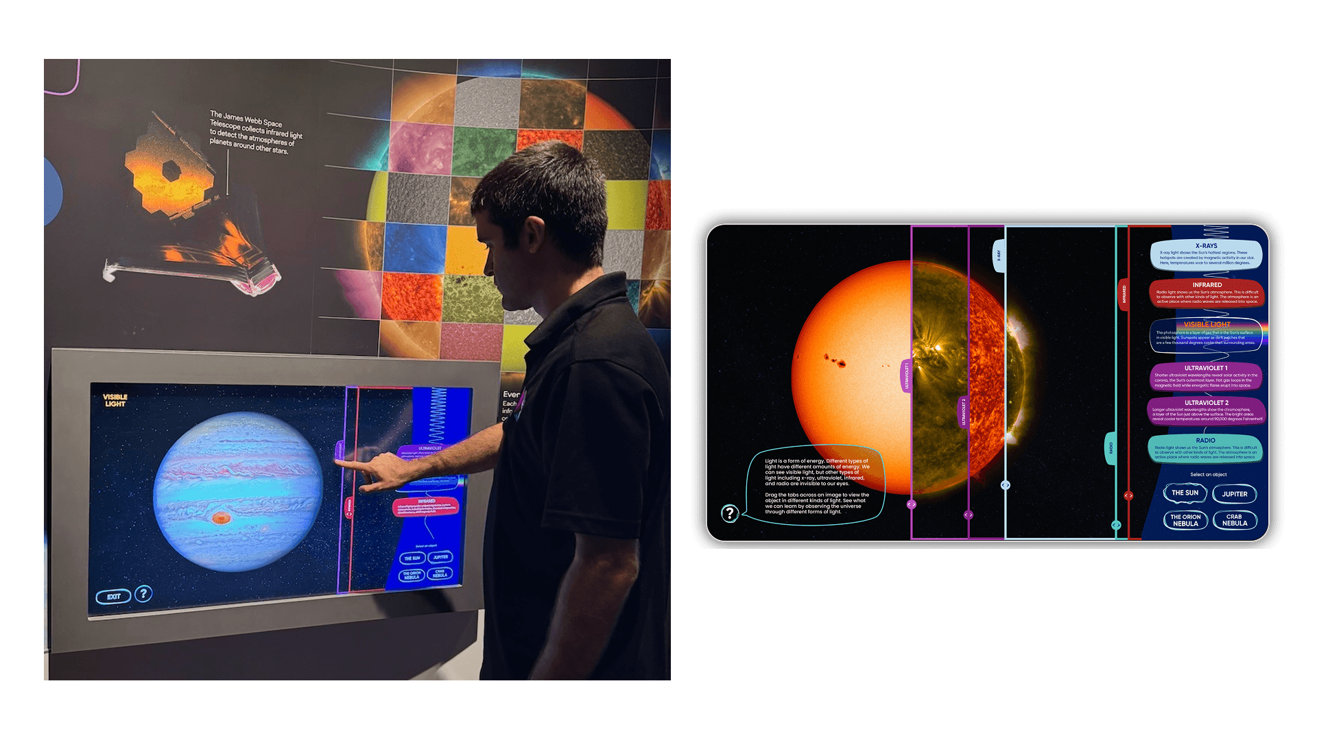
The Mixing Wavelengths flow. Visitors pick an object, then drag tabs to compare it across wavelengths side by side, looping back to try another object.


Wireframes
The user flows and content shaped the wireframes for each interactive, screen by screen. The wireframes focused on layout and function: what button goes where, what each control does and how a visitor moves from one step to the next, including how to layer the content so it never felt heavy.
Across the three, I wireframed Send Your Message as a guided flow from record or photo to review, adjust, send and the broadcast wall; Decoding the Drake Equation as the branching equation with six variable dials that update the estimate live; and Mixing Wavelengths as picking an object and dragging tabs across it to compare it in different wavelengths, with a side panel that explains what each kind of light reveals.


Visual Design
Kei Space set the visual direction: real astronomy imagery, hand-drawn illustration, open questions and educator characters. I helped build the media style guide on that foundation and applied it across every interactive.
The palette pairs Lowell's blues and rich black with pink, aqua, and orange accents, plus illustration colors. Titles use Gilroy, body uses Fakt Pro, and the narrator voice uses Source Serif Pro, always in a speech bubble so visitors know when the exhibit is talking to them. UI buttons are transparent with an outline that ripples when pressed, with a regular and active state.
We used color to mean something. In Send Your Message, pink and aqua keep it warm and personal with the astronaut and "Earthling" avatars. In Decoding the Drake Equation, pink marks the active variable and aqua the total. In Mixing Wavelengths, each kind of light gets its own color, so the spectrum reads at a glance.
That consistency mattered because different designers owned different interactives and the shared system is what held them together.


Prototyping & Testing
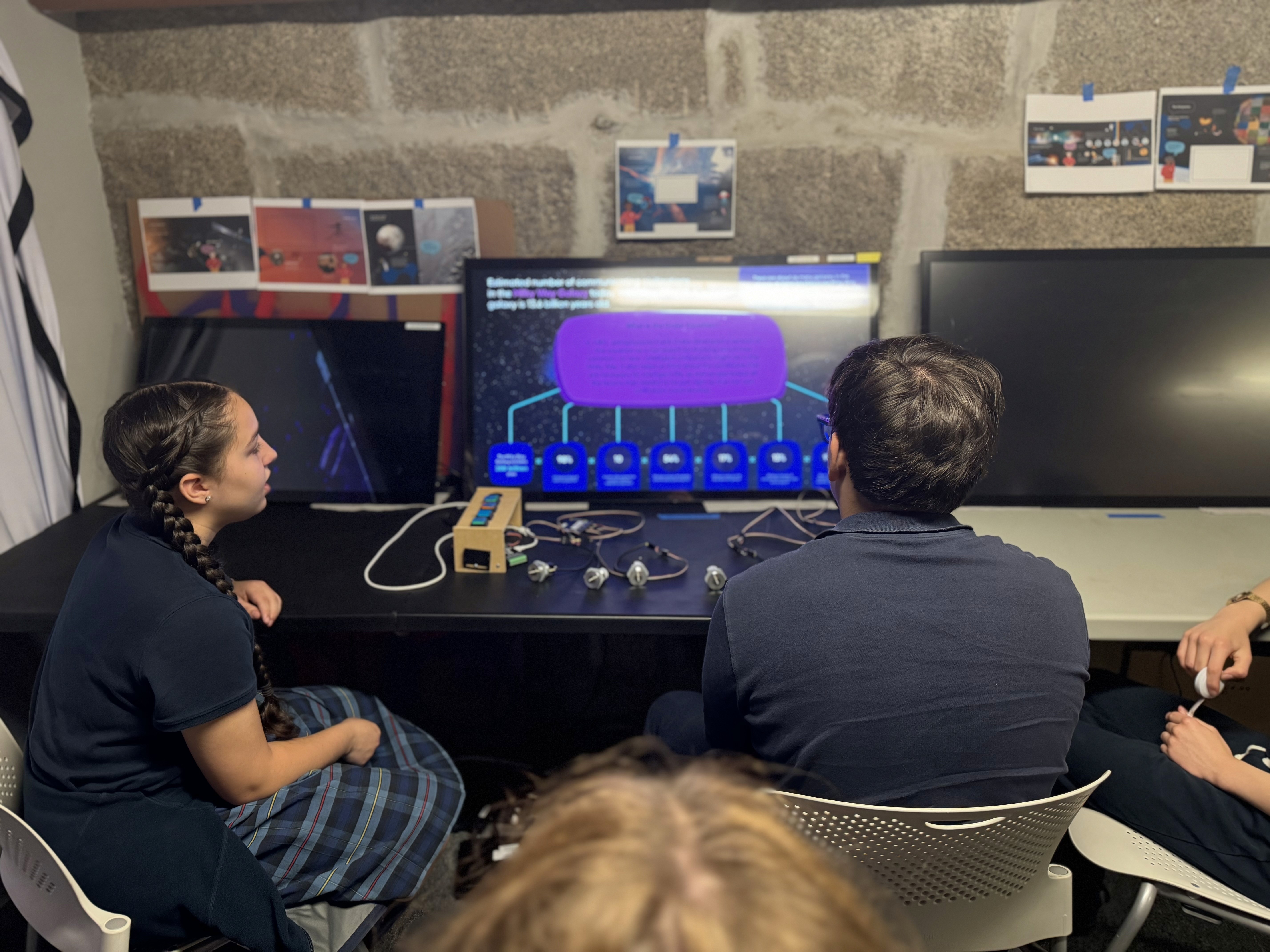
Once the structure worked, I prototyped with developers and tested in rounds, from quick click-throughs to the built interactive on real hardware.
Round 1: Figma click-throughs to catch confusing or missing steps early.
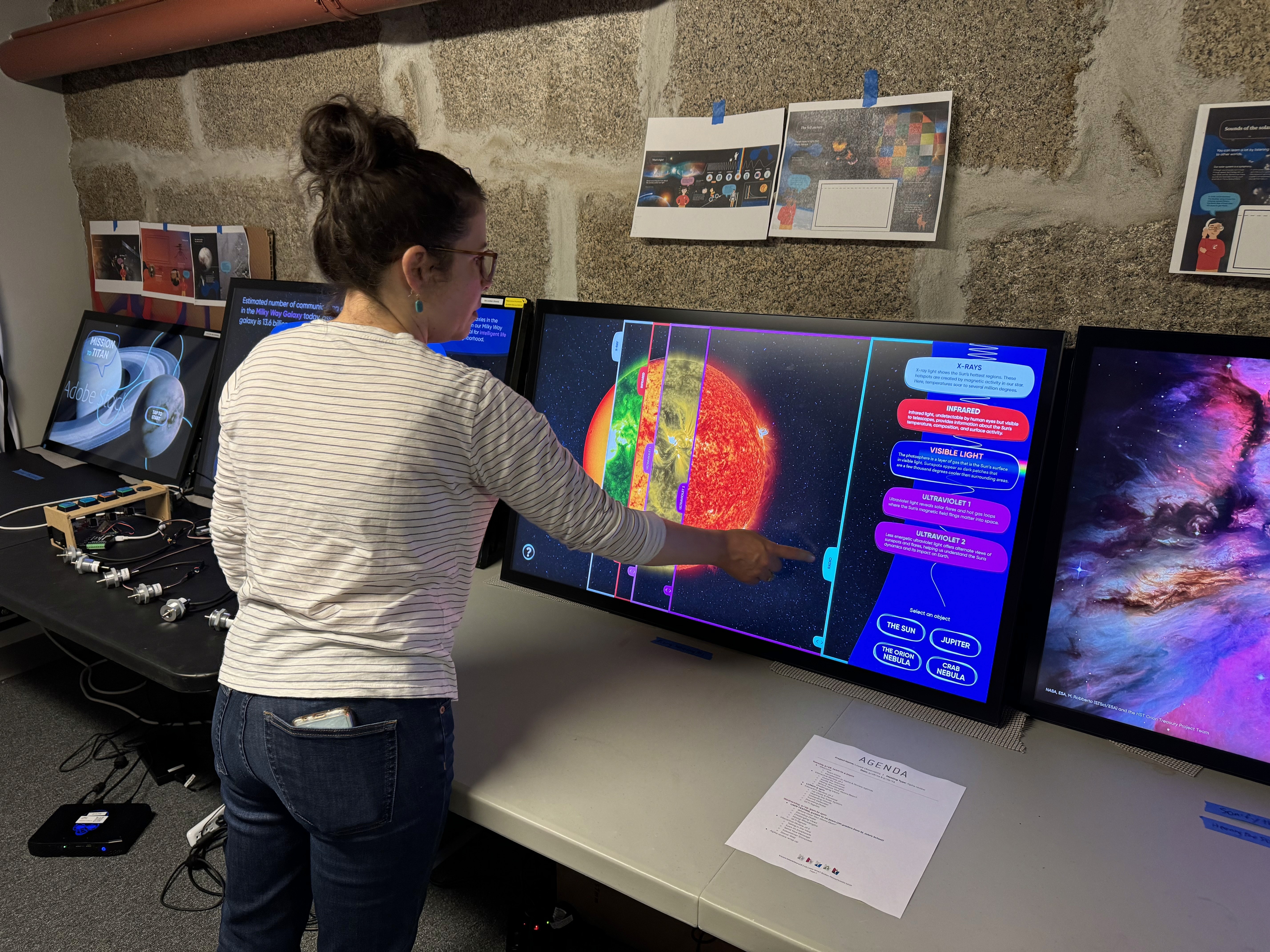
Round 2: alpha and beta testing, where real users came in and the client observed. Visitors from middle school were visitors who moved through the interactives on improvised hardware while the Lowell team watched, and what they saw fed straight back into changes.
What testing changed:
Across every interactive, testing led to simpler home screens, clearer icons and feedback, tighter copy, and accessibility built in. The hardest problems were specific to each one:
For Send Your Message, testers kept skipping the opt-in, so I redesigned it as a popup instead of a checkbox so it couldn't be missed.
Decoding the Drake Equation had too much text and it confused testers, so I worked with the educators and content team to cut it down while keeping it accurate.
Mixing Wavelengths was the hardest. The tabs revealed so much about each object that it overwhelmed testers, so I filtered it down to what mattered. The colors had to stay true to each kind of light, so the visuals took a lot of iteration to get both clarity and accuracy.


The Experience
Send You Message
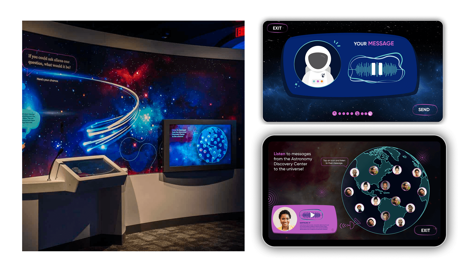
Send Your Message is a two-screen system, a private recording kiosk and a public broadcast wall. It opens on a mural prompt, "If you could ask aliens one question, what would it be?" The flow is guided: record a voice message, take a photo, review and then Send.
Send is the whole point. Because the wall shows messages to the entire room, consent couldn't be a buried checkbox. It had to be the action itself. Nothing goes public until the visitor sends it so the opt-in can't be missed and it stays within ADA reach. The wall is where it lands. A globe of "Earthling" portraits, each one a message any visitor can tap and listen to.
Decoding the Drake Equation
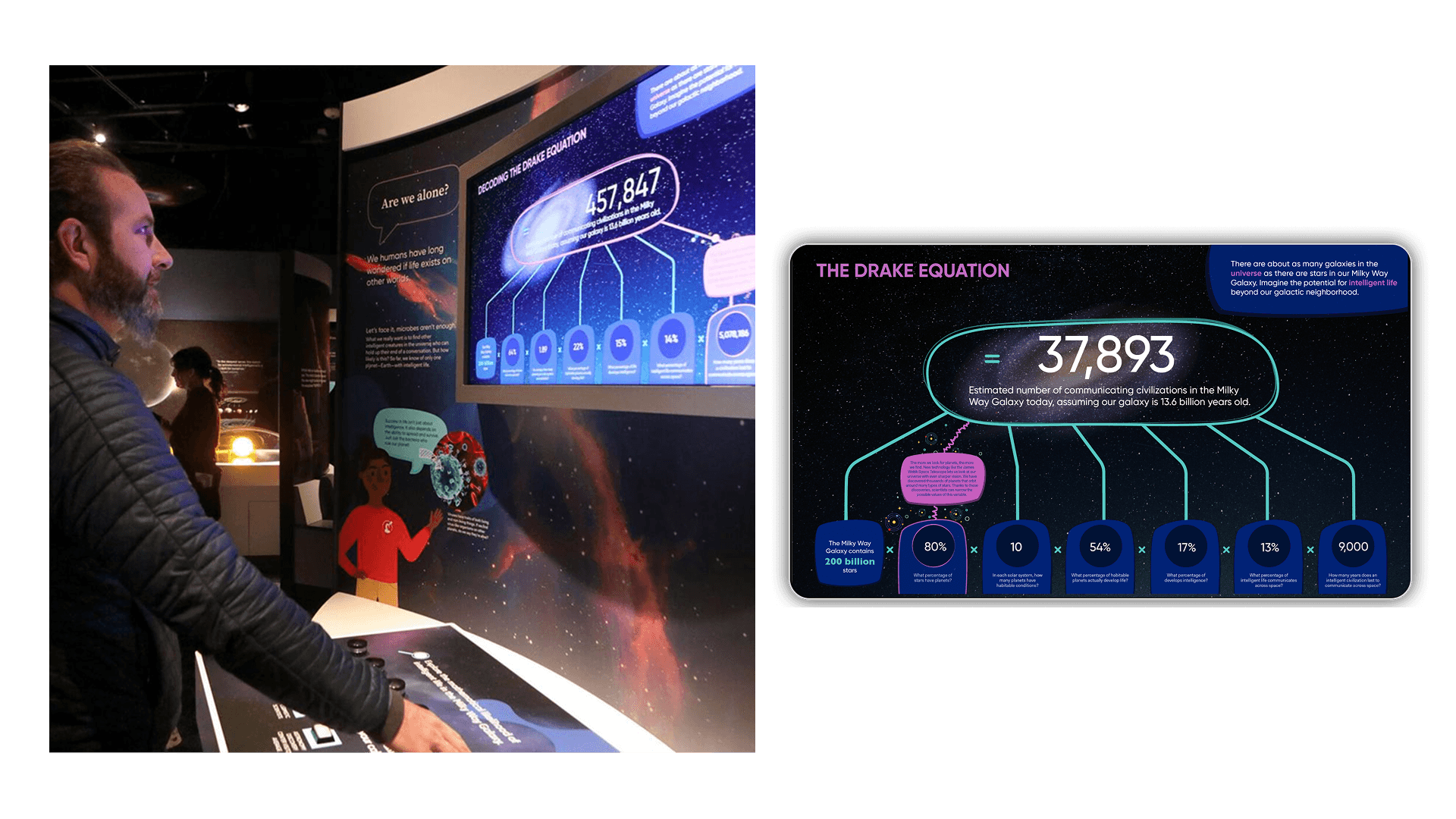
Framed by a familiar question "Are we alone?", it turns an intimidating formula into something you work with your hands. Visitors turn physical dials to set the equation's six variables, from the Milky Way's 200 billion stars to how long a civilization lasts. The estimate updates live as they go. Color does the explaining: magenta marks the variable in play, teal links it to the running total. Pop-up tips add more for anyone who wants it.
Mixing Wavelengths
An intro bubble sets it up. Light is energy and we only see a tiny part of it. X-ray, ultraviolet, infrared and radio are all invisible to us. Visitors drag tabs across one image, the Sun, Jupiter, the Orion Nebula or the Crab Nebula, to see it in each kind of light side by side, in real time, instead of flipping between views. Color-coded cards explain what each band shows, from X-ray hotspots to radio emissions.
Outcome & Impact
Increased average dwell time per exhibit.
Lowell Observatory voted Best Science Museum in Newsweek's Readers' Choice contest, 2025.
Visitor surveys showed improved comprehension of astronomy topics.
Higher engagement among children and family groups.
This project sharpened how I design for many audiences at once, work across content, development, and fabrication, and lean on testing to make abstract ideas tangible. Turning something as invisible as a wavelength or as vast as the Drake Equation into a single confident gesture, a dragged tab or a turned dial, is the kind of problem I want to keep solving.